Identity Guidelines
Visual Identity Guidelines — Saudi Mining Polytechnic
This page explains the correct use of the Saudi Mining Polytechnic visual identity for partners, external entities and media.
Brandmark
Logo structure and usage
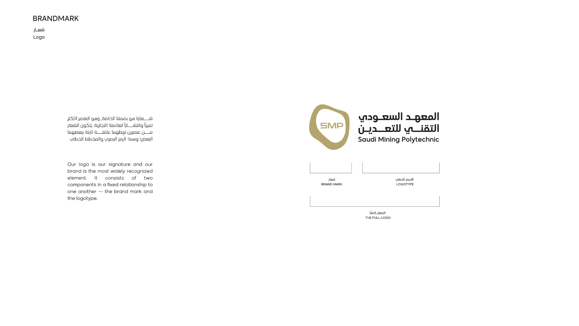
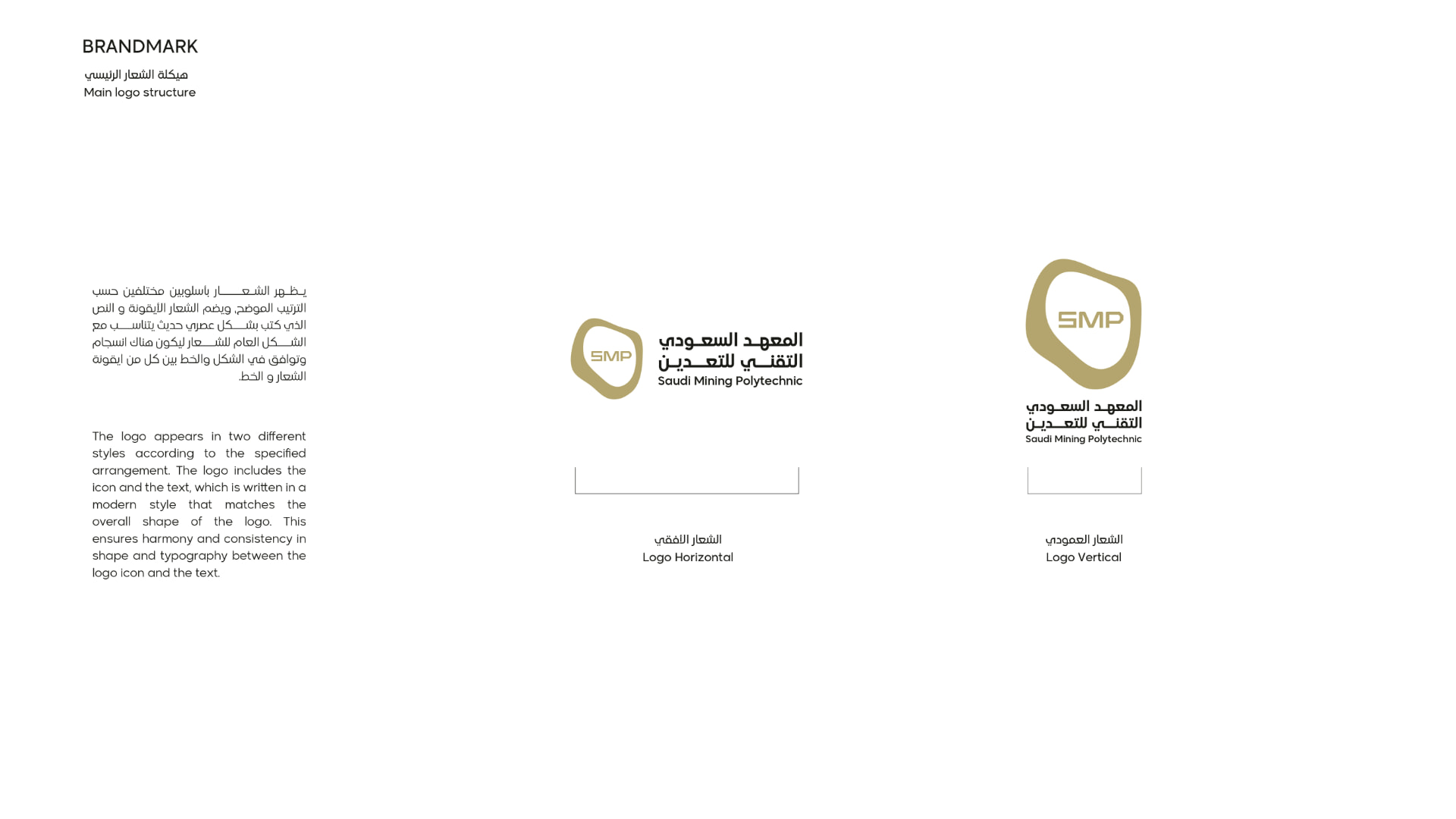
Logo components
The logo consists of two elements in a fixed relationship: the brand mark and the logotype. It appears in horizontal and vertical lockups. The two elements must never be separated or rescaled independently.
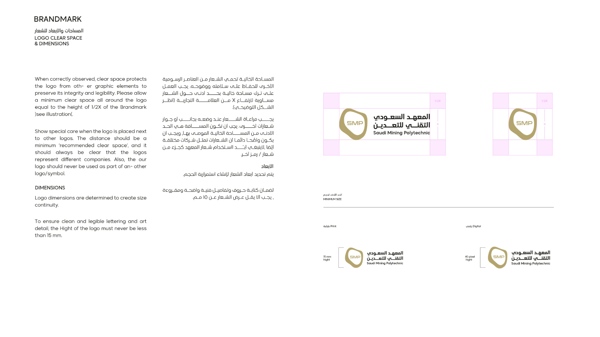
Clear space & minimum size
Leave a clear space around the logo equal to at least half the height of the brand mark. Minimum height: 15 mm in print and 40 px digitally.
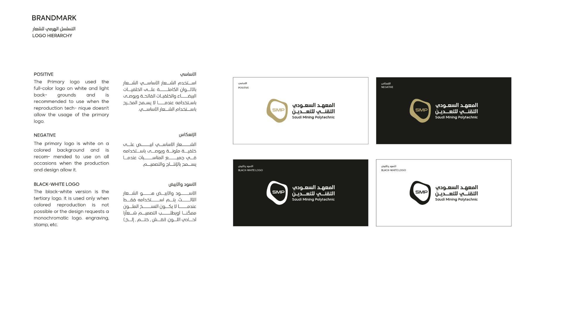
Logo versions
Positive for white and light backgrounds, negative (white) on colored or dark backgrounds, and black-and-white only when colored reproduction is not possible (engraving, stamping, etc.).
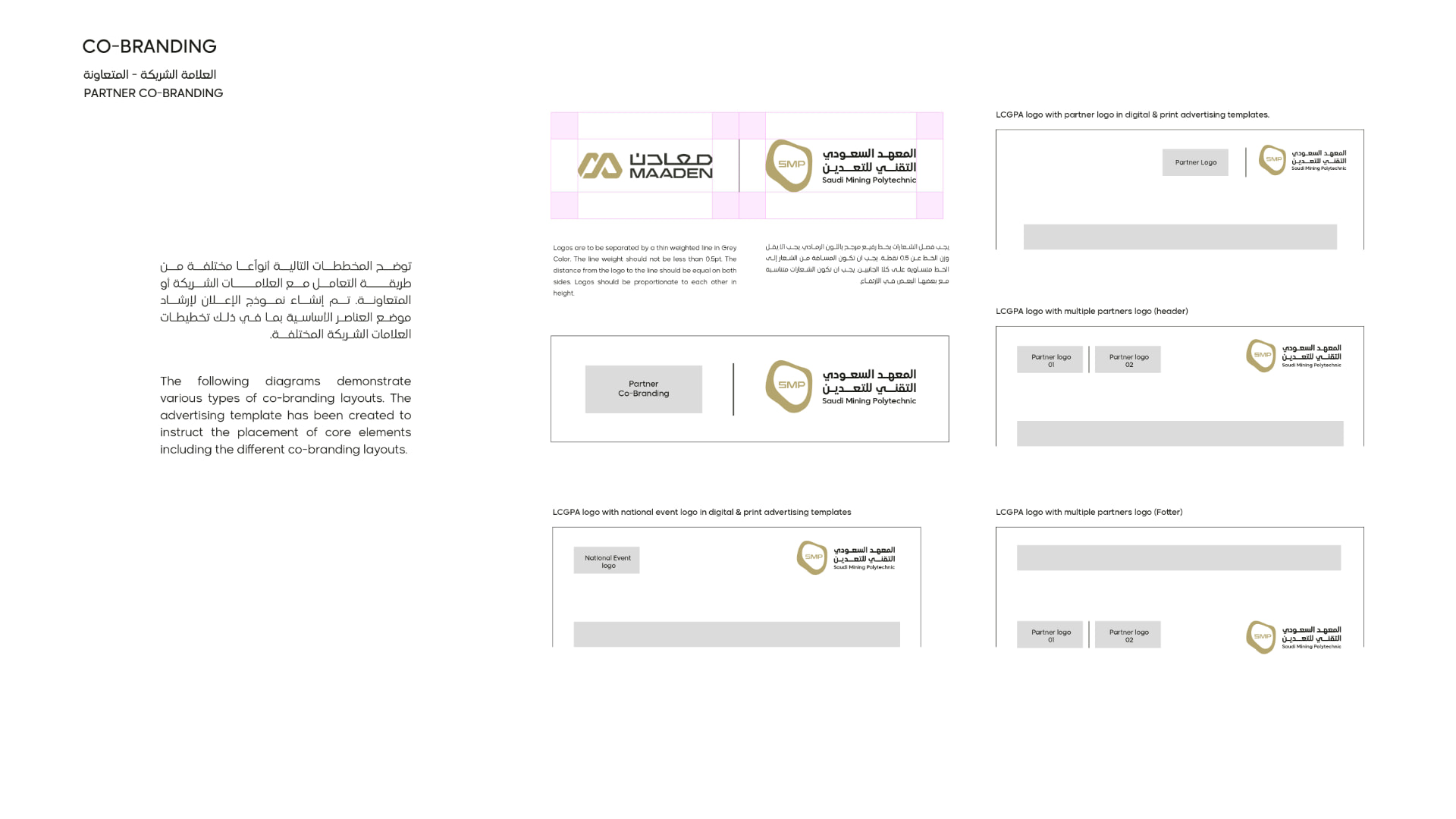
Co-branding
When placed next to other logos, keep at least the recommended clear space, maintain balanced visual sizes, and never merge the SMP logo into another mark.
Colors
Primary palette
Gold
HEX #b4a56f
RGB 180, 165, 111
CMYK 31, 30, 66, 1
Black
HEX #1b1c19
RGB 27, 28, 25
CMYK 72, 65, 68, 78
White
HEX #FFFFFF
RGB 255, 255, 255
CMYK 0, 0, 0, 0
Typography
Brand typefaces
Madani Arabic
Logo typeface only. Madani Arabic is used in the logo and approved identity elements. It must not be used in letters, emails or printed documents.
Tajawal
Correspondence typeface. Tajawal is used in letters, emails and all printed documents, presentations and reports.
Restrictions
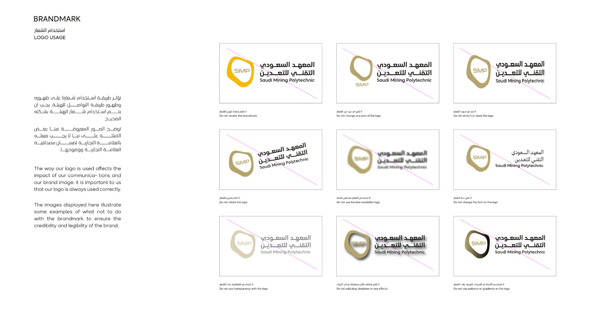
What not to do
Do not recolor the brandmark
Do not change any part of the logo
Do not stretch or skew the logo
Do not rotate the logo
Do not use a low-resolution logo
Do not change the font on the logo
Do not use transparency with the logo
Do not add drop shadows or effects
Do not use patterns or gradients
Downloads